10,000 search results
(0.026 seconds)
- Monotype Script MT by Monotype,
$29.99 - Monotone - Unknown license

- Scrapt Script by Brainware Graphic,
$12.00 ScraptScript is a classic casual script typeface inspired by signpainter and autotechno typography, developed with a little bit bold and contrast on horizontal stroke. Comes with a lot of opentype features, ScraptScript also supports multilingual covering Latin based language (Latin Extended-A & Latin Extended Additional), including Celtic, Sami, Maltese, Turkish, England, USA, Germany, France, Italy, Poland & etc. ScraptScript would be nice on logo design, posters, etc. with any design characteristic.
 - Nonstop - Unknown license

- Monologous by Comicraft,
$49.00 From A to B, or not to Z: that is the question mark: whether 'tis nobler in the mind to kern with the left and right arrows of outrageous keyboards, or to take arms against a sea of ' thought bubbles,' and by opposing, burst them? To sigh, with those little fireflies: to sleep; No more; and by sleep that is to say we end each line of dialogue with 'zzzzz;' The heart-shapes and the thousand drops of sweat popping off my forehead that sight of flesh is sure to produce, 'tis a consummation devoutly to be letter'd. To die with still at least five balloons of dialogue, to sleep; perchance to flashback to a scene in a previous issue while a picture of my head floats in the corner of each panel: ay, there's the rub; 'Nuff Said.
 - Monocto by Lafonts,
$29.00 Monocto is an upright italic, clearly evidenced by the lowercase letters a, e, f, g, i, k, l, v, w, x, y and several capitals. On one hand, the design is inspired by an historical German running hand written with a pen angle of 45°, and on the other, by rational, utilitarian monospace types, similar to those designed for the mechanical typewriter during the Industrial Revolution. As the writing tool touches the paper, a double-square with broken corners is produced, which then, according to ductus, transforms itself into letter components that are either 90°-verticals or 45°-diagonals. The systematic geometry of Monocto offers unexpected design possibilites.
 - Monitor by Device,
$29.00 Monitor is an early experiment in TV-wall pixeldom, and has the unique property of becoming easier to read the further away one gets.
 - Monstores by Maulana Creative,
$13.00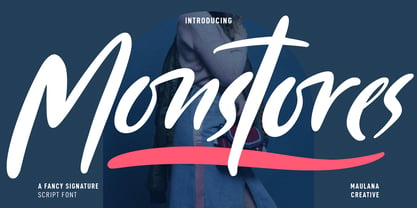 Monstores is a fancy signature script font. With slanted felt-tip stroke, fun character with a bit of ligatures, swashes and alternates. To give you an extra creative work. Monstores font support multilingual more than 100+ language. This font is good for logo design, Social media, Movie Titles, Books Titles, a short text even a long text letter and good for your secondary text font with sans or serif. Make a stunning work with Monstores font. Cheers, MaulanaCreative
 - Monolog by Polytype,
$20.00 Monolog is an especially monolinear rounded display typeface, designed to work great alongside monoline illustrations, logos and icons, while still performing well in some text settings. A number of contemporary quirks in its construction establish visual interest, while Monolog’s clean, geometric forms allow it to remain extremely versatile, great for a wide range of applications and themes. Some good uses would include branding and identity work, signage, packaging, web and app design; anywhere from a hip coffee shop to a contemporary arts gallery, a music festival or a craft microbrewery. Stand-out features include double-stacked capital ligatures, abbreviation and catchwords ligatures, interesting capital forms, and alternates – including a stylistic set to swap the default circular forms for ovals to give Monolog a more condensed and pragmatic style. Big thanks to Ilya Ruderman, who kindly helped me to improve my cyrillic alphabet.
 - Moontok by Ardyanatypes,
$15.00 Hello, Let's play with Moontok! a handmade font with a fun, sweet, also playful type character that gave extra cuteness and perky at once. Like how it named, the cheerful shape bring imaginations to fluffiness, sweetness, cuties, cookies, coffee latte smells, cheesecake, happy kids, even refresh summer trip Moontok has an OpenType feature that will automatically change each character into stunning ligatures, easy! The alternates tail bring cheerful accent to your wondrous display composition, both make more flexible exploring your needs and also including sexy punctuations Even the font shape has a fun impression, the clear bold line still fit to represent something cool and fresh also making it very easy to read and applied in various design styles such as crunchy poster designs, snacks packaging, logos, promotional artworks, storybooks, business cards, website header, and many more design projects. Moontook has its own charm of cheerfulness itself moreover combined with sharp and funny color. It will so easy to remember, catchy and flawless. wanna play more? jump up to try your words Happy summer times!
 - Monotage by Fargun Studio,
$14.00 Monotage a modern combination Monoline Script and Sans. Monotage Font Duo, a classy, contemporary pair of Monoline Script and Sans. With a stylish didot-style Sans font and a free-flowing, expressive script companion, Silver South offers beautiful typographic harmony for a diversity of design projects, including logos & branding, wedding designs, social media posts, advertisements & product designs. Monotage Script • A clean, free-flowing script font containing upper & lowercase characters, numerals and a large range of punctuation. Monotage Sans • A classy Sans font containing uppercase characters, numerals and a large range of punctuation. Creates a perfect pairing contrast with Monotage Script fonts. Monotage Script Ligatures & Alternates • Monotage Monoline Script also includes 5 character ligatures and 130 alternates. To enable the OpenType Stylistic alternates, you need a program that supports OpenType features such as Adobe Illustrator CS, Adobe Indesign & CorelDraw X6-X7. There are additional ways to access alternates, using Character Map (Windows), Nexus Font (Windows), Font Book (Mac) or a software program such as PopChar (for Windows and Mac).
 - Monostep by YOKKMOKK,
$55.00 Monostep is not just another Typewriter. It can do so much more! It is available in five rigorously designed font styles; all of these come in Straight, Rounded and in Italics respectively. It contains geometric symbols as well as all of the characters of the Indo-European alphabet. What makes it so different, and thereby remarkable, are the 77 ligatures that combine letters in upper case, in upper case with lower-case letters and any combination of lower-case letters. Monostep is alive! It will be introduced into the typing script market with a highly characteristic corporate design. Various promotional gimmicks such as a specimen brochure, posters, a website, animations and a promo film with a distinct sound, including lyrics and a dance, make Monostep a truly recognizable label - they bring Monostep to life. That will make you want more: Let me see your Monostep! www.monostep.de
 - Mototype by T-26,
$19.00 - Monopol by Suitcase Type Foundry,
$39.00 The type family consists of six well-distinguished weights, from hair-thin all the way to the one black as the deepest night. In line with the current trend, it touches all boundaries, it stretches beyond technical possibilities and in extremes, it is almost illegible – the counters are reduced to a hairline. All italics have the same proportions as their corresponding regular styles, which emphasises the block-like appearance of the set text. Monopol was designed to thrive on posters, exhibit stands, book covers, magazines, and in complex visual styles. Its twelve styles make it an ideal tool for creating a dynamic composition using solely typographic means.
 - Monotalic by Kostic,
$30.00 Monotalic was created as a fun experiment, exploring better solutions for the monospaced type design. Most monospaced (fixed-width) typefaces have the same main design problem regarding the lowercase – filling the empty space around l, f, i, j and r. That usually brings the addition of slab serifs to those narrow characters, causing many monospaced fonts to look and feel alike. Monotalic solves that problem by adopting the handwritten (or cursive) form for those problematic characters, which allows them to be defined in more strokes, thus getting a better distribution of form in that fixed-width space. On the other hand, cursive writing usually lacks the legibility of a Roman (Regular upright) style, so Monotalic was created to be a hybrid, taking the best of both worlds. Monospaced fonts today are mostly used for coding. Modern code editors use colored text in order to differentiate between different kinds of code. So, in that environment there’s actually no need for traditional text styling by adding Italics, Bold or other styles, because the code lines are overstated as it is. That is why Monotalic focuses on one style only, in three widths and four weights. The weights allow users to choose the perfect contrast of text on screen, depending on their monitor resolution and background color in the editor. Movie scripts are almost exclusively set in 12pt Courier. It became the industry standard because when set in the specific “screenplay format" it helps with the breakdown of the schedule and budgeting process of the film production. Although it looks completely different, text set in Monotalic (Normal width) will take the same amount of space as Courier.
 - Monkton by Club Type,
$36.99 The inspiration for this typeface family came from my childhood experiences at West Monkton, amidst an historic part of the South West of England. Studies of the original incised capitals of the Trajan column in Rome were analysed and polished for this modern version. The lower case letterforms and numerals were then created in sympathy, taking their proportions from the incised letters of local gravestones. Its name honours not only the area where the original alphabet was conceived and drawn, but also the people responsible for fostering my initial interest in letters.
 - Monotype Janson by Monotype,
$29.00 The Monotype Janson font family is based on types originally cut by the Hungarian punch-cutter, Nicolas Kis circa 1690. Named after Anton Janson, a Dutch printer. The original matrices came into the hands of the Stempel foundry in Germany in 1919. New type was cast and proofs made; these were used as the source for Monotype's version of Janson. The original hand cut Janson types have a number of small design irregularities which give the typeface its unique charm. These have been carefully incorporated into the new version. The overall effect is of even color and an easy readability that makes Monotype Janson most at home in book and publishing work.
 - Monotype Clarendon by Monotype,
$40.99The first Clarendon was introduced in 1845 by R. Besley & Co, The Fan Street Foundry, as a general purpose bold for use in conjunction with other faces in works such as dictionaries. In some respects, Clarendon can be regarded as a refined version of the Egyptian style and as such can be used for text settings, although headline and display work is more usual. - Greeting Monotone by Monotype,
$29.99Based on Art Nouveau models, Greeting Monotype was created by M.F. Benton in 1927. The Greeting Monotone font works well for titling, packaging and greeting cards. - Monotype Goudy by Monotype,
$40.99Over the course of 50 years, the charismatic and enterprising Frederic W. Goudy designed more than 100 typefaces; he was the American master of type design in the first half of the twentieth century. Goudy Old Style, designed for American Type Founders in 1915-1916, is the best known of his designs, and forms the basis for a large family of variants. Goudy said he was initially inspired by the cap lettering on a Renaissance painting, but most of the flavor of this design reflects Goudy's own individualistic style. Recognizable Goudy-isms include the upward pointing ear of the g, the diamond-shaped dots over the i and j, and the roundish upward swelling of the horizontal strokes at the base of the E and L. The italic was completed by Goudy in 1918, and is notable for its minimal slope. Goudy Bold (1916-1919) and Goudy Extra Bold (1927) were drawn not by Goudy, but by Morris Fuller Benton, who was ATF's skillful in-house designer. Goudy Catalogue was drawn by Benton in 1919-1921 and was meant to be a medium weight of Goudy Old Style. Goudy Heavyface was designed by Goudy for Monotype in 1925, and was intended to be a rival to the successful Cooper Black. Goudy Modern was designed by Goudy in 1918; its small x-height, tall ascenders and shorter caps impart a spacious and elegant feeling. Benton designed Goudy Handtooled, the shaded version that has just a hairline of white through its bold strokes. The Goudy faces, especially the bolder weights, have long been popular for display and advertising design. They continue to pop up all over the world, and still look reassuring to our modern eyes." - Monotype Sabon by Monotype,
$34.99Sabon was designed by Jan Tschichold and released in 1967. Sabon was created in response to the specific needs of a group of German printers who wanted a typeface that would be identical in form when produced by three different metal-casting technologies. Named after Jacques Sabon, a sixteenth century typefounder whose widow married another typefounder, Konrad Berner, who is credited with issuing the first typefounder's specimen sheet. Several types on the sheet were attributed to Claude Garamond, and one of these served Tschichold as the source for Sabon roman. The italic was based on another face on Berner's sheet, cut by Robert Granjon. Tschichold's skillful adaptation of these old style faces has produced an elegant and workmanlike book face. The Sabon font family is a popular choice for setting text. - Monotype Corsiva by Monotype,
$89.00 Monotype Corsiva is an italic typeface made in the style of the early Italian cursives as exemplified by the work of the writing master, Ludovico degli Arrighi, in the sixteenth century. The capitals of the Monotype Corsiva font are of swash design, with characteristic flourishes, designed primarily for use as initial letters. Monotype Corsiva can be used for short text passages in advertising but is best used to add sparkle to invitations, greetings cards and menus and to give a sense of occasion to certificates and awards.
 - Monotype Scotch by Monotype,
$29.00Scottish typefounders exerted a strong influence on the development of "transitional" typefaces, the bridge from "oldstyle" (Jenson, Garamond) to "modern" (Bodoni, Didot) designs. Scotch Roman designs were first cut by Englishman Richard Austin and cast by the Scottish typefounder Alexander Wilson and Son in Glasgow. Scotch Roman font has wide proportions, short descenders, bracketed serifs, and large, strong capitals. Its subtle charm makes it suitable for any text setting, particularly books and magazines. - Monotype Broadway by Monotype,
$29.99For many type lovers, Broadway is the quintessential Art Deco typeface. Designed as an all-caps typeface in 1927 by Morris Fuller Benton for ATF, it was expanded two years later with a lower case designed by Sol Hess, who also drew the inline version, Broadway Engraved. - Monotype Baskerville by Monotype,
$29.99 John Baskerville (1706-1775) was an accomplished writing master and printer from Birmingham, England. He was the designer of several types, punchcut by John Handy, which are the basis for the fonts that bear the name Baskerville today. The excellent quality of his printing influenced such famous printers as Didot in France and Bodoni in Italy. Though he was known internationally as an innovator of technique and style, his high standards for paper and ink quality made it difficult for him to compete with local commercial printers. However, his fellow Englishmen imitated his types, and in 1768, Isaac Moore punchcut a version of Baskerville's letterforms for the Fry Foundry. Baskerville produced a masterpiece folio Bible for Cambridge University, and today, his types are considered to be fine representations of eighteenth century rationalism and neoclassicism. Legible and eminently dignified, Baskerville makes an excellent text typeface; and its sharp, high-contrast forms make it suitable for elegant advertising pieces as well. The Linotype portfolio offers many versions of this design: ITC New Baskerville® was designed by John Quaranda in 1978. Baskerville Cyrillic was designed by the Linotype Design Studio. Baskerville Greek was designed by Matthew Carter in 1978. Baskerville™ Classico was designed by Franko Luin in 1995."
 - Monotype Bodoni by Monotype,
$40.99 Bodoni expresses the beginning of the Industrial Revolution; its serifs are flat, think and unbracketed, while the stress is always on the mathematically vertical strokes. Bodoni believed in plenty of white space and therefore descenders are long. The M is rather narrow; in the Q the tail at first descends vertically and the R has a curled tail. The italic, like most continental modern faces, has roman serifs. Monotype Bodoni provides a clear-cut effect due to its simplicity. It reproduces well, particularly in sizes over 12pt. This font is slightly darker than Bauer Bodoni. The contrast makes Monotype Bodoni appear more condensed.
 - Monotype Clearface by Monotype,
$29.99A rather narrow and compact design, Monotype Clearface combines both old style and antique characteristics. The lowercase letters are tall, the ascenders and descenders quite short. The intention was to produce a typeface that was easy to read in small sizes, hence the name. Monotype Clearface Bold was first cut for mechanical composition in 1922, and was based on the Clearface Gothic design created by Morris Fuller Benton for ATF in 1910. Although designed as a text face, Monotype Clearface is now more commonly used in advertising and display work. - Monotype Lydian by Monotype,
$40.99 Lydian is an unusual sans serif face with strongly calligraphic letter shapes, originally cut by American Type Founders. The eye-catching nature of the Lydian font family has made it popular for use in magazines and advertising as well as in newspapers for headlines and introductions. The cursive has an even more marked pen-drawn structure.
 - Monotype Gallia by Monotype,
$29.99Monotype Gallia's design was initially developed by Wadsworth A. Parker for the American Type Founders (ATF) in 1927. Monotype released its own version in 1928. Its style is embodied with the spirit of the American Art Deco age and the Roaring 20s. It makes a superb headline selection, and has also been used effectively for packaging as well. Also try the typeface on signage, menus, invitations, or stationary. If you like Monotype Gallia, check out Monotype Broadway, too! - Monotype Engravers by Monotype,
$40.99 The rather wide, caps-only Monotype Engravers family imitates scripts that evolved from copperplate and steel plate engravers hands of the nineteenth century, which were a quite expressive medium! Monotype Engravers' letters show a strong contrast between thick and thin strokes and have sharply cut serifs. In 1899, Robert Wiebking (who worked for a number of foundries in his time) designed an all-caps typeface named Engravers Roman."" Shortly thereafter, American Type Founders, Inc. (ATF) released another successful ancestor of this design in 1902, ""Engravers Bold,"" designed by Morris Fuller Benton. Engravers Bold was also released by the Barnhart Brothes & Spinder foundry. Also made available by Lanston Monotype at the beginning of the twentieth century, the Engravers faces soon became a popular choice for letter heads, advertising and stationery.
 - Monotype Bernard by Monotype,
$40.99In the early years of the twentieth century a number of romans with a soft and slightly script like quality were evolved. Although they did not represent the future in terms of the major design influences that were to appear after the First World War, they were a break with the past, and were developed further in the nineteen twenties and thirties. Monotype Bernard Condensed is closely associated with this period, a condensed roman evoking an easy charm. The Monotype Bernard Condensed font offers many display applications where warmth and friendliness is required. - Monotype Ionic by Monotype,
$29.99 The earliest form of Ionic was brought out by Vincent Figgins in 1821 and was intended for display work. In 1863 a more refined version appeared which had more contrast between thick and thin strokes and the serifs were bracketed. Further developments were made, however the robustness of the Egyptian style was retained making the face suitable for newspaper text setting. With a large x-height and strong hairlines and serifs, the Ionic font family became widely used by the newspaper industry as a body type and provided a model for many twentieth century newspaper typefaces.
 - Monotype Sorts by Monotype,
$29.99Monotype Sorts is a collection of symbols for use with a wide range of contemporary typefaces. The Monotype Sorts font contains useful bullets, stars, arrows and figures in circles. - Monotype Grotesque by Monotype,
$40.99 This updating of Berthold’s Ideal Grotesque was supervised at Monotype in 1926 by F.H. Pierpont. With some of the eccentricities in the borrowed original reduced, this series retains enough character to have become one of the world’s great sanserifs.
 - Monotype Century by Monotype,
$29.99 - Monton by Larin Type Co,
$12.00 Monton is a wonderful font family that includes from thin to black style as well as in oblique style, a total of 18 fonts. This is a condensed block sans-serif font that is perfect for titles, logos, branding, posters, flyers, website design, advertising, labels, packaging, web titles, text descriptions and much more. It is well readable and irreplaceable in modern design and can be used as a main or additional one.
 - Monotes by Aqeela Studio,
$15.00 Monotes is an upper and lower serif font with balanced curves. Like all of my fonts inspired by letters from the good old days, but still has a strong modern look. A variety of alternative styles allow for versatile design options and work perfectly for headlines, logos, posters, packaging, T-shirts, postcards and more.
 - TNG Monitors - Unknown license

- Monoron Serif by Fontron,
$30.00MonoronSerif is the serif version of MonoronSans. - ID Monotrap by ID Typeface,
$15.00 ID Monotrap is a display monospace typeface, specifically designed with equal width for each letter across the glyphs set. With mono weight, maintaining consistent stroke thickness throughout its parts, giving it a distinct and modern aesthetic.


Page 1 of 250Next page